Travelers' Health Website
A health organization wanted to ensure that users were able to navigate to the portion of the site aimed at their population, and evaluate the hypothesis that medical practitioners would want their own more detailed content.
Background
A health organization was working on a redesign of their Travelers’ Health website to align it with their new web style guide.
Additionally, the organization wanted to validate new content and evaluate the hypothesis that medical practitioners would want their own more detailed content.
Specifically, they wanted to ensure that users were able to navigate to the portion of the site aimed at their population (Travelers vs. Clinicians), to evaluate how well the data tables communicated the risk for different diseases in different countries, and to determine user preferences for different conventions for presenting and providing access to information (e.g. pop-up windows vs. expandable / collapsible modules.
Process
In-person and remote sessions were conducted with both travelers and clinicians. Each was asked to evaluate two different versions of the Travelers’ Health website.
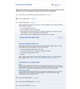
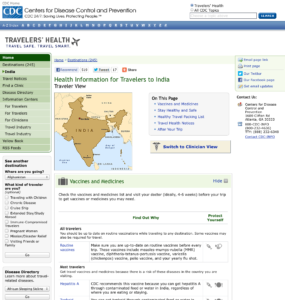
Respondents were given the chance to interact with both prototypes and give feedback on each. The two versions each had a different layout for the homepage as well as different presentations of information. The order of presentation was rotated from respondent to respondent in order to avoid ordering effects
Respondents were asked to find the content that they needed to educate themselves about the health risks and appropriate precautions for a trip to India and were asked to give feedback on the site’s content as well as the layout and organization of information.
Findings and Recommendations
Both travelers and clinicians saw the content as valuable and trustworthy, though both wanted assurance that information was up-to-date.
I recommended that the final version of the site employ expandable / collapsible modules for additional information on the page, as this was the general preference of users and also served to modernize the site and eliminate the potential for users to get lost in multiple windows. Additionally, feedback from clinicians indicated that multiple windows could potentially bog their systems down, as most medical offices and travel clinics employ older machines.
I recommended clearer wording around yellow fever vaccinations, as this had been especially confusing to respondents, to the point that it actually frightened some travelers away from the idea of traveling to some destinations.
I also recommended allowing users to toggle between traveler and clinician view upon reaching their destination page, as both types of respondent might situationally want access to the content aimed at the other type. Clinicians were wanted to be able to walk their patients through the traveler-focused content. And some travelers felt comfortable with the level of detail of the content aimed at clinicians and wanted the option to get the “insider information.”

