Treasury Management System
A client was acquired by a larger bank and had been tasked with updating their online treasury management system, so they wanted to take the opportunity to update the application in order to provide an optimal user experience.
Background
The client company had recently been acquired by a larger bank and had been tasked with updating their online treasury management system to match the visual guidelines of the parent company. Additionally, the client wanted to take this as an opportunity to update the application and assure that it was providing an optimal user experience. They wanted to know about potential difficulties or pain points and how they could be addressed as well as gaining insight into new features or functionality which would be desirable to users.
Process
I spoke with all major stakeholders who would be involved with the project, including representatives fro Product, IT, Development, and Marketing.
Additionally, I conducted contextual research with a variety of customers using the current treasury management system. Customers were located in the Atlanta metropolitan area, Alabama, Texas, and Colorado. 50% of respondents worked for large clients, while 50% worked for – midsize clients.
During the research, I spoke with the respondents about their needs and desires from a treasury management system and any pain points they had. Additionally, I had them walk me through their most common tasks using the current system.
Results and Recommendations
A number of major themes emerged from the stakeholder research:
- The application needed to be redesigned from the ground up; giving the existing application a facelift would not be sufficient.
- The application’s look and feel needed to be updated to make it more current and modern in order to stay on par with competitors
- The overall navigation structure of the application should be changed to better accommodate users’ needs; navigation was seen as being problematic
- Current functionality must be maintained
- Currently offered service bundles can be canted as long as functionality is not lost
- Documentation is extremely detailed, but users are not reading it
- Terminology used throughout the application i understood by experienced cash managers, but may not be customer friendly for small business users
- Approval functions need to be streamlined and should be mobile-accessible
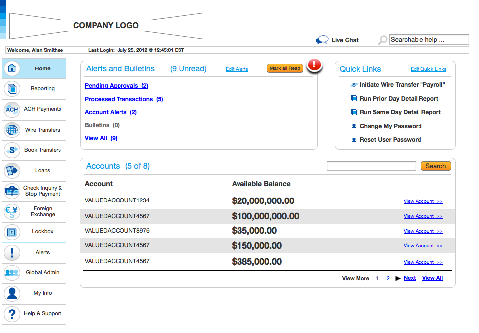
- A dashboard providing quick at-a-glance information would be desirable
A number of major themes emerged from the end-user research:
- End users saw the application’s look and feel as “dated,” comparing unfavorably with competitors
- The application’s functionality is organized according to features and the order in which they were added rather than according to users’ mental models
- Certain processes (such as ACH payments) require the user to move from section to section in order to complete them, rather than presenting a straightforward workflow, making these functions tedious and difficult to learn
- Users respond positively to the concept of a dashboard, presenting at-a-glance information and quick links to common functions and reports
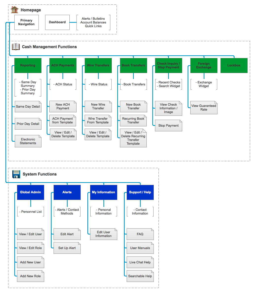
Based on these findings, I recommended the following:
- A revised information architecture based on feedback from end-users
- Streamlined workflows for overly complex tasks
- An updated visual design to make the application more modern
In conjunction with visual design resources, I was able to produce an interactive prototype which was tested to validate the design updates, allowing the design to be iterated.
- Finance
- Websites
Research Methods:
- Contextual Research